Choosing the palette of your front door is one of the most impactful decisions you can make. Whether you are updating your driveway, patio, curb, courtyard, or garden walkway, knowing how to choose paver colors has a direct influence on aesthetics, functionality, and even the feel of your space over time.
The right tones can enhance architectural features, create harmony with natural surroundings, and elevate the value of your property – and this holds true for everything related to outdoor design.
This process goes beyond preference, stretching into design principles, color theory, material performance, and environmental considerations. For many homeowners and designers, this is a creative endeavor and an opportunity to express personal style in a subtle and lasting way.
Let’s dive into this subject right away – so we can guide you through the process of selecting colors and materials for your pavers.
Jump to:
How to choose paver colors for your outdoors
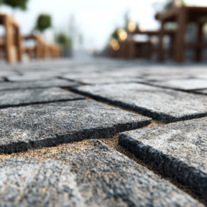
Colors influence the visual perception of your outdoor space by setting the mood, complementing the architecture of your home, and affecting thermal performance under sunlight.
This means that, when chosen thoughtfully, paver colors tie together outdoor elements like landscaping, garden features, water elements, outdoor furniture, and lighting. They help establish continuity between indoor and outdoor spaces, improving the overall design flow.
Architectural integration and style
Your paving stones should harmonize with the architectural style of your home.
Traditional homes often pair well with warm, earthy tones that echo natural stone. Modern architecture, on the other hand, often favors cool tones, muted grays, and charcoal hues. Understanding your home’s character is the first step in learning how to choose paver colors.
Matching too closely to your home’s exterior can create monotony. Conversely, bold contrast without cohesion can feel disjointed. Successful color choices help architectural elements stand out instead of overpowering them.
Effect on perceived space and temperature
Color affects how large or small a space feels. Light colors reflect sunlight and can make areas feel more open and expansive. Darker tones absorb light, which can visually tighten an area and also absorb heat.
This is especially important in climates with intense sun. Choosing lighter colors in warmer regions can help keep surfaces cooler underfoot – improving comfort during hot days. Understanding this thermal behavior is essential to unite beauty and practicality.
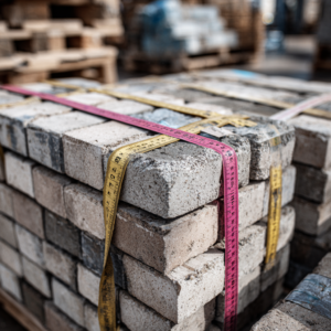
Maintenance and longevity of appearance
Unfortunately, some colors show wear more easily than others. Light, uniform colors tend to display stains, dirt, and tire marks more readily. Pavers with mixed tones or medium shades often camouflage natural wear and tear, making maintenance easier over the years.
During the decision process, factoring in how a color will look months and years after installation is just as important as how it looks on day one.
Read also: Indoor paver tiles – why consider paving stones for your flooring
Key considerations for choosing your paver colors
Learning how to choose paver colors successfully involves methodical planning. Our following considerations will guide you to a choice that is stylish, functional, and suitable for long-term enjoyment.
Assess your existing environment
Begin by looking at the colors in your home’s exterior. Examine brickwork, trim, roofing, siding, and outdoor elements like fences or pergolas. Your paver colors should build on these existing tones rather than compete with them. A balanced palette helps create a cohesive and inviting outdoor environment.
Take note of strong colors in the façade or natural elements nearby. For example, a home with warm wood tones and beige stucco might pair beautifully with terracotta or taupe pavers. A home with cool gray siding may work best with slate gray or deep charcoal tones.
Evaluate natural lighting
Lighting has a significant impact on how colors appear, of course. Sunlight intensifies and brightens tones, while shaded areas often soften them. This means that paver colors can shift in appearance between morning and afternoon or between different seasons.
Look at your space at various times of the day before finalizing a color; if possible, view large sample boards in place under natural light. This step reduces surprises and ensures the chosen color performs well visually in real conditions.
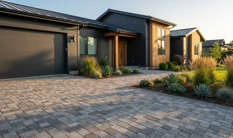
Consider the function and traffic
The function of the paved space also helps determine the ideal color. High-traffic areas like driveways benefit from medium shades and mixed tones that conceal tire marks and small stains. Decorative patios or entertainment spaces may lean toward lighter, more refined colors that enhance brightness and comfort.
Also consider features such as outdoor kitchens, fire pits, or pool areas, where color can help define functional zones and contribute to overall design unity.
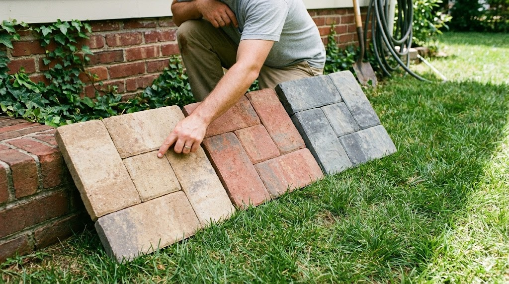
Popular paver color trends and styles
While color preferences ultimately depend on personal taste, there are some trends and timeless options that resonate well across many outdoor designs.
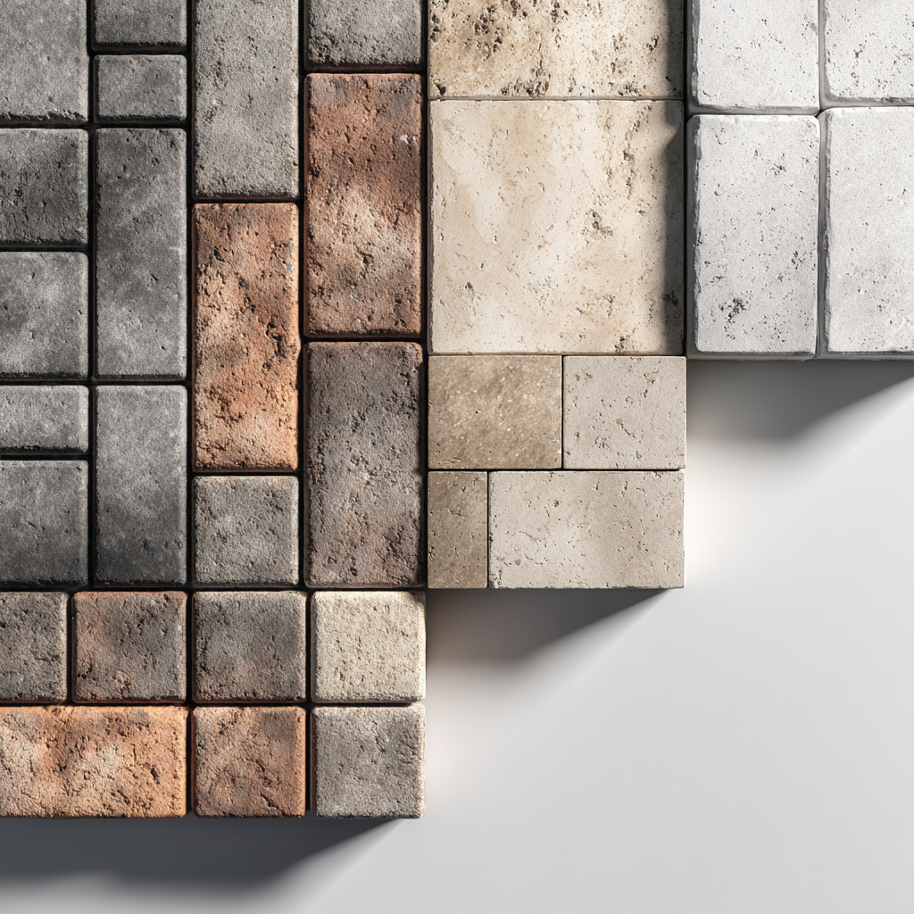
Natural earth tones for classic appeal
Earthy colors such as sandstone, beige, light brown, and warm taupe are versatile and blend beautifully with plantings and outdoor stone features. Natural tones often provide a sense of warmth and comfort that feels right at home with traditional landscapes and rustic architectural styles.
These colors are also forgiving in irregular lighting conditions and can help camouflage dirt and discoloration over time.
Cool grays and charcoal for modern aesthetics
Cool gray tones, slate hues, and charcoal are increasingly popular for contemporary designs. These tones create sleek outdoor spaces that contrast well with greenery and minimalist architectural elements. Gray pavers pair exceptionally well with metal finishes, glass railings, and bold landscaping.
If you’re looking for a modern or transitional style, keep in mind that these tones offer visual depth without overpowering other design elements.
Blended and multi-tone pavers for visual interest
Pavers that feature color blends or subtle gradients offer a layered look that adds dimension to outdoor spaces. These colors create complexity without chaos and help soften transitions between paved areas and gardens, stone walls, or water features.
Blended tones also help disguise wear over time, making them a practical choice for busy outdoor areas.
Expert guidance makes all the difference – and JS Brick helps you make it all
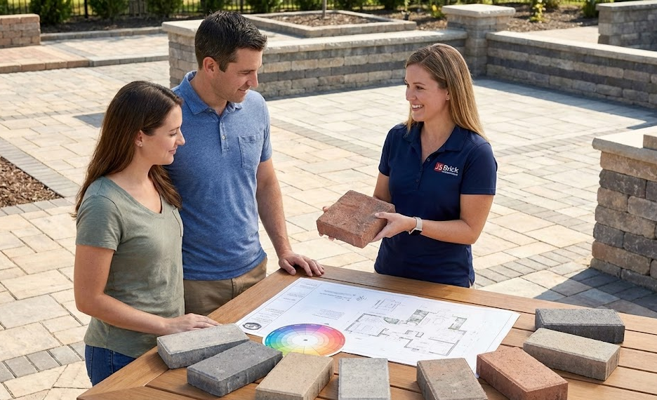
Choosing paver colors is an art and a science – and professionals like us, who are trained in outdoor design, understand not only trends but also the practical effects of color on space, usability, and long-term satisfaction.
So why not start by exploring paver options with trusted professionals you can trust in your area? Once you have clarity on your design goals, the right color selections will elevate your outdoor space into a welcoming, stylish extension of your home.
And of course, if you happen to be around Sarasota, in Florida, we here at JS Brick offer expert advice on how to choose paver colors by evaluating your home’s style, landscape, usage patterns, and lighting!
With experience in a wide range of materials and finish options, we can recommend color palettes that are both visually compelling and tailored to your specific needs, right at your place.
Contact us today for a free estimate on our services!